One Brief, Two Ways to Design: What an Image-First Workflow Changed
I gave the same fictional editorial brief to two isolated implementation runs. One designed directly in code. The other followed an image-first workflow: establish the visual direction with generated reference images, then implement and repeatedly align the real page to those references.
This is a visual demonstration of how the working process changes the result, not a benchmark.
- Open the code-first page
- Open the image-first, skill-guided page
- View the Visual Page Design skill on GitHub
The shared brief
Both pages interpret NORTH/WEST — No. 04: After Ice, a fictional field journal about memory, sound, and changing northern landscapes.
The required page included an editorial hero, three stories, a long-form Field Notes sequence, a mailing-list interaction, reading progress, responsive desktop and mobile compositions, keyboard-accessible controls, reduced-motion support, and only local assets.
The content and constraints stayed the same. The design process changed.
Designing directly in code
The code-first page formed a strong system from elements that are natural to express programmatically: a dark field-instrument palette, large editorial type, survey rules, maps, waveforms, and an ice-shelf illustration built from SVG and CSS.
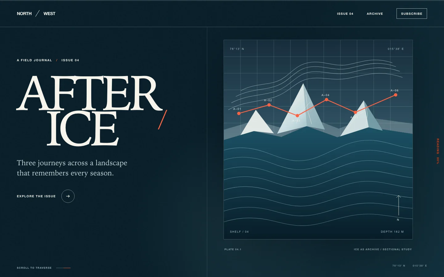
Explore the complete code-first page →
The result is coherent and controlled. Its shapes, type, lines, and responsive rules behave like one publication system. On mobile, the same visual grammar is reorganized into a deliberate reading sequence.
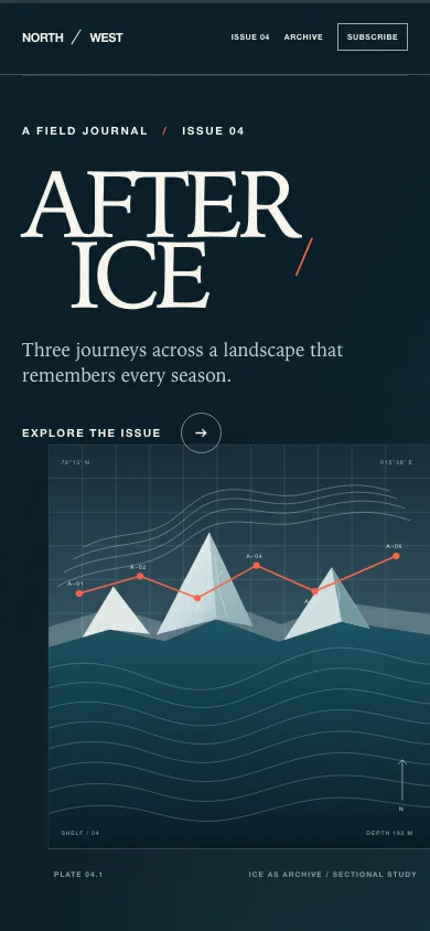
Designing from generated visual references
The skill-guided page began by making the design visible before treating the page as code. It generated separate desktop and mobile reference directions, planned the major scroll beats, identified the needed image system, and produced original sea-ice and field-journal assets.
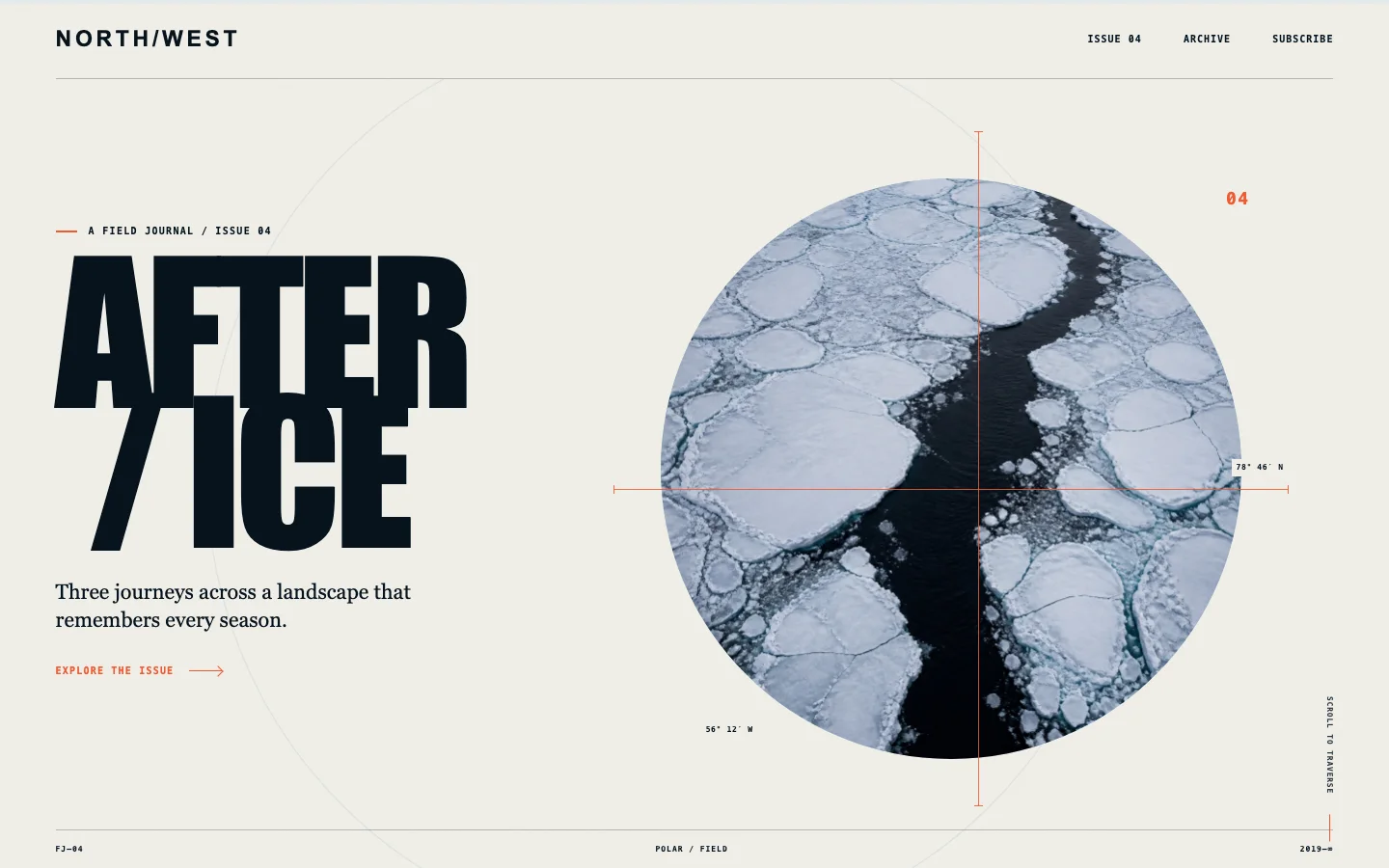
Explore the complete image-first page →
The visual difference is immediate. The page is more vibrant, photographic, and spatial. The sea-ice aperture, condensed cover typography, crosshair, story photography, and editorial measurements give it the feeling of a designed artifact rather than a sequence of correctly styled components.
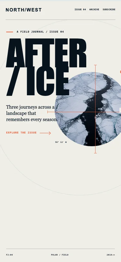
The generated reference also constrained the implementation. Instead of letting the coding agent invent a new composition section by section, it gave the agent a concrete visual target for hierarchy, crop, density, contrast, and rhythm.
What the image-first process changed
The most useful change was not simply “more images.” It was moving visual decisions earlier.
A reference image can express several decisions at once: how large the title feels, how photography and type overlap, where the eye lands first, how empty space is distributed, how technical marks create texture, and what the whole first viewport feels like. Describing all of that only in text leaves far more room for interpretation.
Once the direction existed as images, implementation became a loop:
- generate and curate the visual direction;
- identify every required page, scroll beat, animation state, crop, image, and icon;
- build the semantic and interactive parts in code;
- generate, draw, or adapt the parts that need visual assets;
- capture the real page at the target viewport;
- compare it with the reference;
- fix the visible discrepancies and repeat.
That loop matters. The generated image is not the finished product, and it is not automatically correct. It may contain impossible geometry, inconsistent components, approximate copy, or details that do not belong in the product. The implementation still needs design judgment.
Why this may work
A plausible explanation is that image-generation models are optimized to construct relationships directly in visual space. They have strong priors for composition, color, material, photographic atmosphere, and the way many small visual signals combine into one impression.
A coding model can know a great deal about design systems, CSS, typography, and familiar web patterns, but its default output medium is still code and tokens. Without a concrete reference, it may solve the brief as a collection of components or invent extra interface elements that feel structurally reasonable but are visually unnecessary.
This is a hypothesis, not a measurement of either model’s training data. The practical observation is simpler: when the coding agent can see a curated visual target, it has less freedom to drift and more evidence for making visual tradeoffs.
The best workflow therefore combines the two strengths:
- use visual generation to explore and commit to the overall composition;
- use code for semantics, layout, controls, responsive behavior, accessibility, and maintainability;
- use generated or drawn assets where code alone would reduce the intended effect;
- compare the real implementation against the reference until the two feel aligned.
What the Visual Page Design skill does
The Visual Page Design skill turns that loop into a compact, reusable process.
It asks the agent to:
- define the page, hierarchy, target viewports, scroll structure, animation states, and visual contract;
- inspect the project’s existing VI, components, tokens, and asset library before inventing new language;
- generate enough reference frames to cover long pages, meaningful motion changes, and materially different mobile layouts;
- pause for user confirmation when the direction is new, expensive, or difficult to reverse;
- implement text, controls, navigation, forms, and reusable components semantically in code;
- keep generating, drawing, or adapting missing images and icons instead of lowering quality to save work;
- reuse existing components when they fit, and propose reusable additions when a new pattern should become part of the design system;
- capture the real page, find every perceptible mismatch, and iterate until the final page preserves the visual intent;
- show the actual implementation to the user for final confirmation.
The skill is deliberately not a demand to turn an entire interface into a bitmap. It separates what should remain editable and functional in code from what genuinely benefits from image generation.
The quality rule
A missing image, icon, crop, breakpoint, or visual state is not a reason to quietly simplify the final page.
If the selected direction needs it, the workflow should reuse an approved asset, draw it, generate it, adapt it, or revise the design honestly. Saving effort alone is not a valid reason to reduce the presentation standard.
The same rule applies during alignment. Small visual differences can accumulate until the page no longer feels like the design. The final pass therefore looks at the complete page—not only the hero—and checks typography, spacing, image treatment, icons, component relationships, interaction states, mobile crops, and whole-page harmony.
Why the demos are separate
The two results are published as independent sites so they can be experienced as pages, not flattened into screenshots inside a comparison shell. Each retains its own scrolling, hover, focus, form, motion, and responsive behavior.
This article is the explanation layer. The live pages are the visual evidence.
The takeaway is not that code should copy generated images mechanically. It is that visual intent becomes easier to preserve when it exists in a form both the user and the implementation agent can actually see.
Comments